Defining a Bold and Consistent Identity

Designity Brandguide

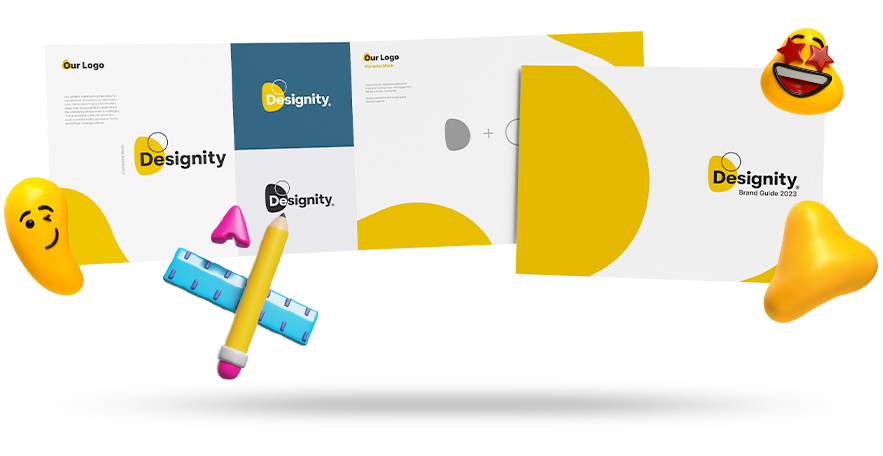
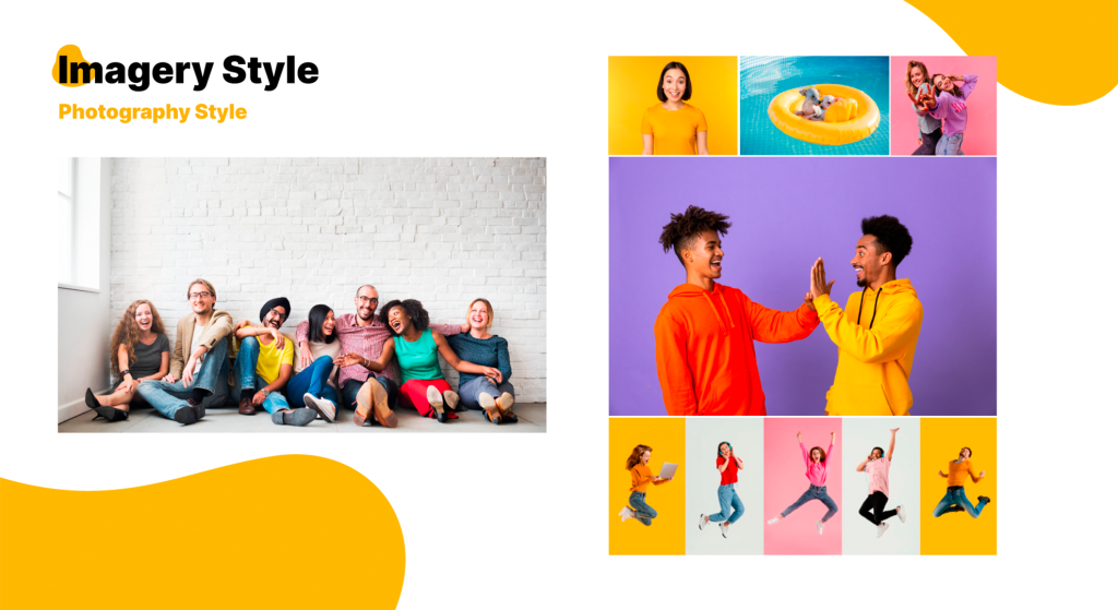
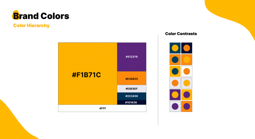
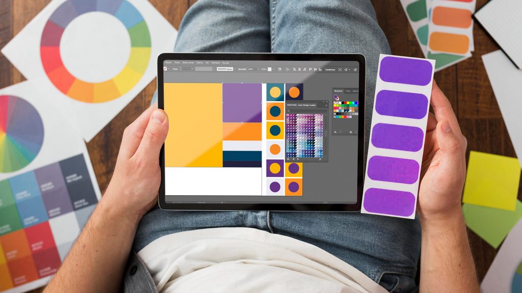
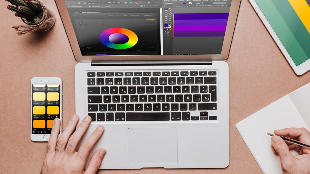
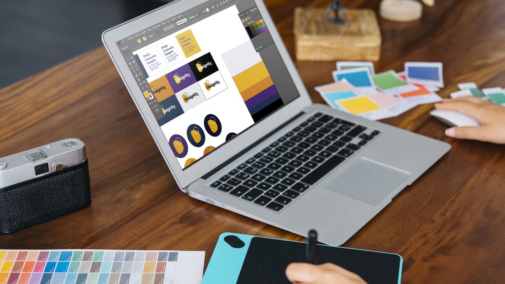
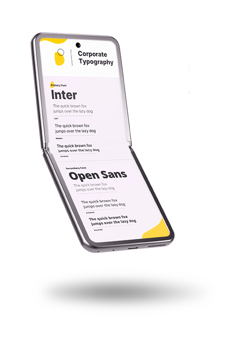
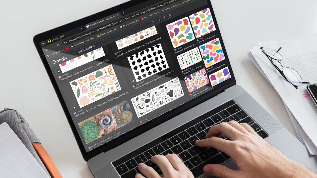
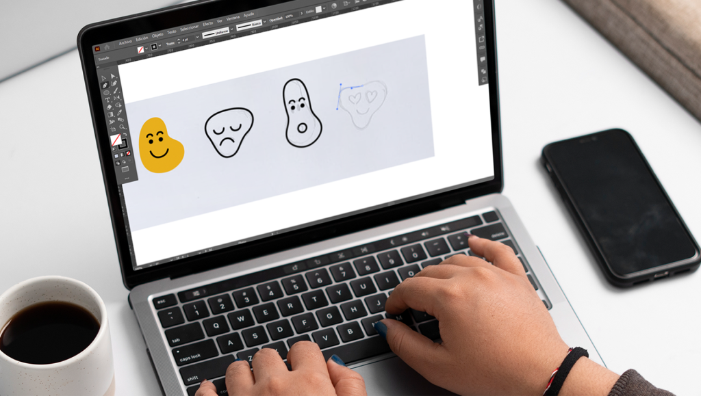
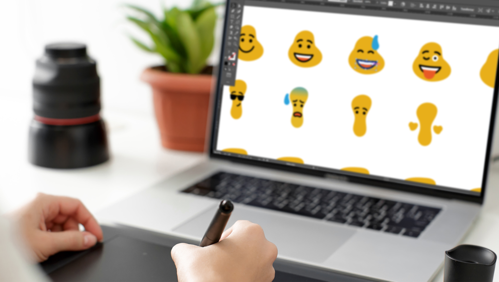
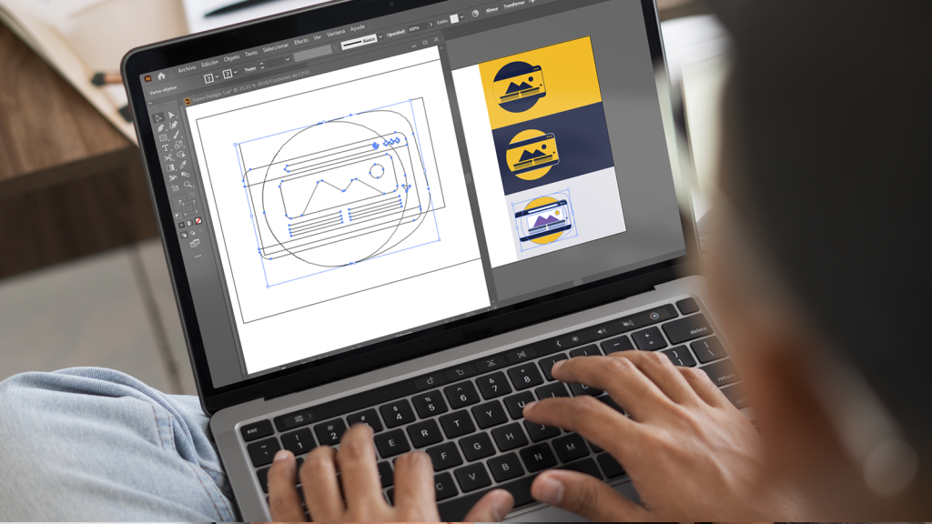
For Designity, I developed a comprehensive style guide that redefined the brand’s visual identity. This included updating the color palette, creating a cohesive visual line to present the brand consistently, and designing unique brand characters (emojis) that added personality and relatability. Additionally, I designed organic forms that helped establish a more consistent and recognizable identity, ensuring the brand stands out while maintaining a professional and creative edge.

Task

Developed a comprehensive brand guide to redefine Designity’s visual identity. This included creating a cohesive strategy, refreshing the color palette, and designing unique brand elements such as icons and emojis to enhance consistency and personality.

Strategy

Crafted a unified visual language to ensure brand consistency and recognition.

Design

Updated color palette.

Created custom icons.

Designed unique emojis.

Developed cohesive visual elements.

Fused with

Designity

Logo

Refined the logo to enhance clarity and alignment with the brand’s identity.

Brand Colors

Selected modern typography to improve readability and reinforce the brand’s personality.

Typography

Lorem fistrum por la gloria de mi madre esse jarl aliqua llevame al sircoo. De la pradera ullamco qué dise usteer está la cosa muy malar.

Organic Shapes

Designed custom organic shapes to add a unique and dynamic visual element.

Emojis

Created personalized emojis to bring a playful and relatable touch to the brand.

Icons

Developed a cohesive set of icons to unify the visual language and enhance usability.

Your virtual creative
team with a designated
creative director

The challenge

Creating a Bold and Cohesive Brand Identity System

Designity needed a refreshed visual identity that combined creativity and consistency. The challenge was to develop a comprehensive brand guide that incorporated modern design elements while maintaining the brand’s playful and professional personality. This required creating cohesive assets, such as icons, emojis, and organic shapes, to ensure a recognizable and unique presence across all platforms.

Brand Colors

A refreshed and expanded color palette was created to reflect Designity’s vibrant and innovative spirit. The updated colors ensure consistency across all platforms while offering versatility for various applications.

Typography

Custom organic shapes were designed to add a dynamic and modern touch to the brand. These forms enhance visual interest and create a unique identity that aligns with Designity’s creative essence.

Organic Shapes

Lorem fistrum por la gloria de mi madre esse jarl aliqua llevame al sircoo. De la pradera ullamco qué dise usteer está la cosa muy malar.

Emojis

Custom emojis were created to add personality and relatability to Designity’s brand identity. These playful elements enhance engagement and reinforce the brand’s approachable and creative nature.

Icons

A cohesive set of custom icons was designed to strengthen Designity’s visual language. These icons provide clarity and consistency while enhancing the user experience across various touchpoints.

Imagery Style

A vibrant and modern imagery style was established to reflect Designity’s creative and approachable identity. The visuals emphasize authenticity, diversity, and a dynamic energy that aligns seamlessly with the brand’s innovative vision.

Let’s get to work

Ready to
work with us?

This website stores cookies on your computer. Cookie Policy