Brand image redesign, doing something cleaner, friendlier and more direct.

To create a stronger nexus between customer and brand, characters were created that interact with the brand.
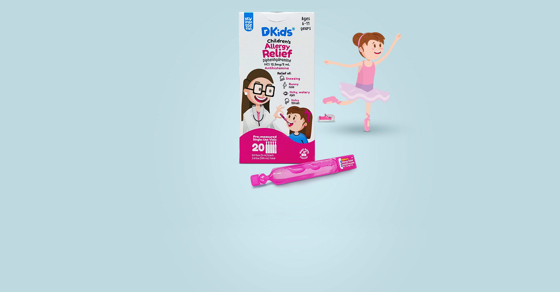
Redesign of the packaging, creating a competitive look in the market, friendly and bright.
Creation of pop material, for different purposes, such as conference stands, corporate walks, business cards, business cards, and more.


The brand that was previously was very loaded, a little memorable, and forced. The proposal that was presented points to something cleaner, more memorable, and friendly.

Characters that interact with the brand were created, creating an emotional connection with the consumer. the characters also function as an indicator to know which medicine to take and for what age the product is.
The packaging is the perfect combination of the elements made for the brand, it is memorable packaging, friendly with young and old and super eye-catching, which stands out from the rest on any shelf.


Logoscorp.com
octubre 5, 2020